Firslty, like many others, I have to say ”Hats of off to Hans’ and of course everyone else who works on the ‘gapminder project’ – With his truly amazing moving data visualisations combined with his enthusiasm – front man Hans Rosling works wonders with stats and maybe makes you think being 60 odd ain’t that bad after all…?!
Secondly, Worldmapper which produces the wonderful maps below – which shrink or expand countries according to whatever variable is being examined – The actual original maps are now a bit dated, but this related views of the world’ site – has a much borader scope and much more up to date information! On ‘views of the world’.
Thirdly, and in at number three because they give us an immediate impression of global inequalities – I still think these colour coded maps are very useful – especially if you project up the map for income, and then HDI/ infant mortality – you can really see the high degree of correlation! The Map below shows HDI – from darkest to lightest blue – Very high to low, 2011 data
Fourthly, these United Nations Human Development Index data trees are cool – which have different colours for the three different elements of data shown in the HDI – Gross National Income per capita, Education levels and Life expectancy.
Fifthly – there is this more in depth data from the UN site – I like this because you can track compare how different elements of the HDI relate to eachother and how they change over time – for numerous countries.
Sixth , and going back to ‘simple earth modelling’ there are these wonderful pictures of ‘the world as a hundred people’
Seventh – there is this miniature earth video – part of the miniature earth project – related to the above obviously – This is the 2010 version – not as nice as the original, as this one’s to whale music…. but the most up to date version!
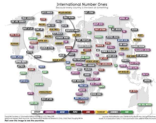
Eighth – there is some great material on this site – Information is Beautiful – not least the ‘International number ones’ infographic – because every country is best at something! (Click on the link above, the pic below doesn’t do it justice!)
Ninth, and only ninth because it’s not really a data visualistaion – but still pretty fab for inducing panic – Worldometers is a counting clock that looks population trends, spending on certain things, environmental decline, deaths from certain diseases and society and media. Some of the things you learn are –
- The world population is 7 billion and counting
- There are 2.3 billion Internet users – growing (rapidly) – also over 3 million blog posts today alone!
- There are 900 billion undernourished people and
- 1.5 billion overweight people
- More than 4 billion a day is spent on the military and 26 billlion so far this year has been spent on drugs!.
And tenth – well I didn’t get to ten – If you really can’t deal with my stopping at 9. then why not suggest youre favourite ‘global data visualisation’?


