Tag Archives: international development

Putting Ebola in Perspective (along with other preventable causes of death in West Africa)

This is just a quick post on the spread of Ebola… Can’t really not do something on this when you teach health and development…..

The spread of Ebola

As of 7th November 2014 there have been 13268 confirmed cases of Ebola and almost 5000 deaths from Ebola, spread across Sierra Leone, Guinea, and Liberia, with 1/2 people contracting the dieseas dying from it. This web site outlines the current cases and deaths from Ebola in West Africa and beyond…..

http://www.cdc.gov/vhf/ebola/outbreaks/2014-west-africa/index.html

Projections

A report from September  (Estimating the Future Number of Cases in the Ebola Epidemic—Liberia and Sierra Leone, 2014–2015) estimated that wthout additional interventions or changes in community behavior, by January 20, 2015, there will be a total of approximately 550,000 Ebola cases in Liberia and Sierra Leone or 1.4 million if corrections for underreporting are made. The report also noted that halting the epidemic requires that approximately 70% of Ebola cases need to be cared for either in Ebola Treatment Units or in a community setting in which there is a reduced risk of disease transmission and safe burials are provided.

What are the symptoms of Ebola?

In a nutshell, victims bleed to death.

AKA Ebola hemorrhagic fever, symptoms typically start between two days and three weeks after contracting the virus as a fever, sore throat, muscle pain, and headaches. Then, vomiting, diarrhea and rash usually follow, along with decreased function of the liver and kidneys. At this time some people begin to bleed both internally and externally.The disease has a high risk of death, killing on average 50 percent of those who contract it, often due to low blood pressure from fluid loss, and typically six to sixteen days after symptoms appear.

Ebola lives on in the deceased for at least three days…..and this is when Ebola is at its most contagious. All it takes is one tiny speck of any of the various body fluids associated with death to enter your body, and you’re infected.

Why is Ebola spreading so rapidly?

Here I focus on Sierra-Leone

(1) The first case….

The first confirmed Ebola case was in Sierra Leone was in May (2014), when a woman was admitted to a government hospital in Sierra Leone. The authorities traced her back to a well known healer in the region, who many people visited both from SL and from accross the border in Guinea, where Ebola had already been confirmed. This healer (for obvious reasons) contracted Ebola herself, and died, and this was seen as a seminal event in Ebola’s spread, with 365 deaths being traced back to her well-attended funeral.

The virus, being highly contageous, spread rapdily after that, with doctors and nurses being common casualties, dampening the ability of the country to delay the further spread of the disease.

(source – http://www.who.int/csr/disease/ebola/ebola-6-months/sierra-leone/en/)

(2) Traditional burial practices in West Africa?

One THEORY of the spread of Ebola is that traditional burial practices, which involve morners touching the deceased, lead to the rapid spread of the disease.

However, the main evidence from this comes from Anthropoligsts who have observed death ceremonies in Uganda, which is firmly in East Africa (see this article) http://www.thedailybeast.com/articles/2014/08/13/kissing-the-corpses-in-ebola-country.html

As one anthropologist describes a UGANDAN burial ceremony…..

In the Ugandan ceremonies the sister of the deceased’s father is responsible for bathing, cleaning, and dressing the body in a “favourite outfit.” This task  is “too emotionally painful” for the immediate family. In the event that no aunt exists, a female elder in the community takes this role on. The next step, the mourning, is where the real ceremony takes place. “Funerals are major cultural events that can last for days, depending on the status of the deceased person.” As the women “wail” and the men “dance,” the community takes time to “demonstrate care and respect for the dead.”  When the ceremony is coming to a close, a common bowl is used for ritual hand-washing, and a final touch or kiss on the face of the corpse (which is known as a “a love touch”) is bestowed on the dead. When the ceremony has concluded, the body is buried on land that directly adjoins the deceased’s house because “the family wants the spirit to be happy and not feel forgotten. These burial rituals and funerals are a critical way for the community to safely transfer the deceased into the afterlife. Prohibiting families from performing such rites is not only viewed as an affront to the deceased, but as actually putting the family in danger. “In the event of an improper burial, the deceased person’s spirit (tibo) will cause harm and illness to the family,”

(3) Mistrust of health workers

Terry O-Sullivan, who spent three years volunteering in Sierra-Leone reports that….

“People have no idea how infectious diseases work. They see people go into the hospital sick and come out dead—or never come out at all,” he says. “They think if they can avoid the hospital they can survive.” This mistrust of the medical world seems to be validated when a family is prohibited from honouring the dead, participating in the funeral, or even seeing the body.”

This is backed up by a report from the BBC World Service (28/10/14) focussing on the ‘dead body management team’ in Sierra Leonne’s capital Freetown – The report described how, with Ebola still on the increase, although the message about the risks associated with the disease is getting through, there is enoromous resistance in rural or semi-rural villages when the disposal team arrives to remove a dead body for cremation. The reason for the resistance is that it is traditional for relatives to bury the body, typically with a lot of physical contact being involved.

The report followed the disposal team into one village, where a 65 year old woman had recently died. Their job was to get the morners ‘on side’, disinfect literally everything in the hut containing the body, bag the body up (in 2 body bags) and remove it, spraying everything on root. In the process the team is thoroughly suited, with gloves taped on. Apparently the most dangerous part of the process is the removal of the suit afterwards, the staff have to be sprayed with chlorine as every layer of protective clothing is removed.

(4)  The literacy rate in SL is only around 35%, which hampers the ability of authorities to explain how Ebola is spread and how to prevent its spread, athough I imagine this isn’t so important given the widespread prevalance of the radio as a means of communication in SL.

(5)  Lack of money and medical resources in SL. In the article above O’Sullivan appears to be suggesting that it would be necessary to have health workers in every village to win the trust of villagers and supervise funerals so that they can be conducted safely, without risk of spreading the disease. Until that happens, he seems to think it’s unlikely that its spread will be stopped.


Putting Ebola in perspective….

Looking at current figures, there are 14 things which kill more people per year than Ebola (including road traffic accidents) – Using WHO data from 2011 To illustrate…..

Deaths %
1. Malaria 13,262 17.77
2. Influenza & Pneumonia 10,761 14.42
3. Diarrhoeal diseases 8,673 11.62
4. Tuberculosis 7,143 9.57
5. Low Birth Weight 3,654 4.90
6. HIV/AIDS 2,775 3.72
7. Birth Trauma 2,748 3.68
8. Maternal Conditions 2,191 2.94
9. Stroke 2,143 2.87
10. Measles 2,047 2.74
11. Coronary Heart Disease 1,788 2.40
12. Meningitis 1,712 2.29
13. Road Traffic Accidents 1,311 1.76
14. Malnutrition 1,176 1.58

15. Ebola (so far in 2014) 1130

NB I don’t want to underplay the threat of Ebola – I’m aware of the unfair comparison and the doubling every 20 days or so. If current projections come true and there are 500 000 or more confirmed cases in SL and the death rate is one in two, then Ebola will top the death league tables for 2015 by a long way. It is, however, important to note that in the table above these deaths are occurring every single year – so cumulatively deaths from preventable causes is a massive problem in SL even without Ebola.

If people really want to prevent West African children dying from preventable diseases then ending poverty in SL is the most important long term goal. Just turning up in chemical suits for a few months and then turning our backs isn’t going to help that much. It will, however make us feel a lot better about ourselves.

Ebola and the globalised culture of fear….

One interesting line of analysis about Ebola is the extent to which media attention reflects predominent narratives in the West….

Ebola sits well with parellel narratives in the ‘globalised culture of fear’ – Ebola’s basically another threat from abroad – just like the immigrants and terrorists – All of our problems come from outside, and the Ebola story reinforces this ignorance, especially when, in its original incarnation, it does actually come from the Heart of Darkness, which is pretty much the same as the all-the-same countries in West Africa.

Ebola also fits well with the Modernisation Theory narrative that ‘backward Africans’ cultural practices lead to them dying off… The predominant focus in the media seems to be on silly Africans with their backward burial rituals, all touching each other and monkeys and bats and given each other Ebola, rather than focussing on the lack of money and facilities which are essential to dampening the spread of the disease and preventing the other 14 preventable causes of death which currently kill more people every year than Ebola’s killed so far this year.

Of course what the media should be focussing on are the year on year causes of death in SL and other poor countries – and the day to day causes of health problems in general – poverty, lack of clean water and poor sanitation, and of course the good ole’ unfair trade rules which keep poor countries poor. This however is a lot more difficult for an ignorant and generally uncaring audience to understand.
 

Cuba – A Development Success Story?

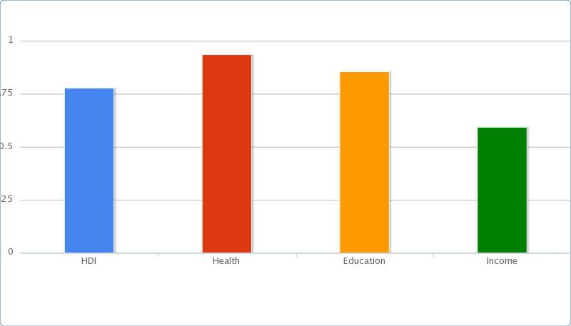
Cuba’s a good case study of  Socialist Model of Development that seems to have worked more effectively than most of the nel-liberal experiments in Latin America…. Today, Cuba’s HDI stats look like this….

chart

Human Development Index
Ranking 59
Health
Life expectancy at birth (years) 79.3
Education
Mean years of schooling (of adults) (years) 10.2
Income
GNI per capita in PPP terms (constant 2005 international $) (Constant 2005 international $) 5,539

Between 1980 and 2012 Cuba’s HDI rose by 0.8% annually from 0.626 to 0.780 today, which gives the country a rank of 59 out of 187 countries.  The HDI of Latin America and the Caribbean as a region is 0.741 today, placing Cuba above the regional average

In this nice infographic (hopefully it’ll work, although there’s probably too much info in it TBH) you can see the comparative development of Cuba compared to Bolivia, Columbia and Chile (three countries which were much more exposed to neoliberal policies – What you can see is that Cuba progresses more rapidly than both Bolivia and Columbia, but not as quickly as Chile. What you can also see (from about 5 years after 1990) is the negative affect the decline of Communist Russia had on Cuba’s development.


So it’s not easy to conclude outright support for any set of policies if just pure economic development is your goal. Although in this post – Cuba, A development Model which proved the developers wrong Jonataon Glennie outlines how a Socialist model of development has worked for Cuba since 1959… The general gist is that the means whereby Cuba developed involved much less human misery than the other three neoliberal examples above – As outlined by John Pilger in the excellent documentary War on Democracy).

To summarise Gelnnie’s article…

No other similar country adopted Cuba’s approach to development, and unlike in other Latin American countries such as Bolivia, Colombia and El Salvador, which experience widespread inequality and related problems, In Cuba, the extremes of opulence and misery are banished in favour of a generalised level of wealth, best described as “enough to get by”.

He notes that from the beginning the instinct at the heart of the revolution in 1959 was that slower wealth creation and limited political repression were a price worth paying for fairer distribution, and the consequent eradication of extreme poverty. It may not have been articulated as such, but that is how it has played out.

Castro’s leadership was the key factor in rapidly rising living standards for the poorest. In 1958, under the Batista dictatorship, half of Cuba’s children did not attend school. The literacy campaign begun by Castro in 1961 led, in 1970, to Unesco declaring Cuba the country with the highest primary and secondary school enrolment in Latin America. These development gains, among others, have continued to this day.

But what of the future?

But there have been two broad consequences. First, a generation of educated young people aspire to more in terms of living standards and life chances than their parents ever did. It is no coincidence that the older generation is more uncritically supportive of the revolution than the young – it knows what Cuba was like before.

Second, state-led development and investment is costly, especially when the international context becomes less favourable. Relying on goodwill, volunteering and accumulated capital has worked perhaps longer than anyone anticipated, but eventually wealth must be created and that, as the critics have always maintained, means a platform for the private sector to grow.

Putting DRC Poverty in Context

DRC – Resource Rich but ‘dirt poor’

The GDP of The Democratic Republic of Congo is $15 billion. GDP (Gross Domestic Product) is the total value of goods and services produced within a country in one year, and so is roughly equivalent to the amount of money that will be spent in total on everything by everyone in one year in that country.**

You might find it difficult to put this amount of money in context, so to give you an idea of how little this it’s useful to think about how we spend similar amounts of money in the UK….

The GDP of the DRC is equivalent to less than half the amount of money the UK Government spends on Housing Benefit per year – (average per year prediction for next four years – $38.1bn (£23.75).

UK government housing benefit expenditure is about 2.5 times greater than the DRC’s GDP

/

The entire population of the DRC have about half as much money to spend as BP.’s profits for 2011 ($25.7 Billion) – (BP. Is the UK’s most profitable company).

BP.’s 2011 profits were nearly twice the GDP of the DRC

/

The UK population spend $9 billion more on their pets than the entire population of the DRC spend on themselves – Total UK pet expenditure per year stands at £14.9 Billion or $23.9bn

People in the UK spend $9 billion more on their pets every year than DRC’s GDP

/

Britain’s second most profitable company, Royal Dutch Shell, made $5 billion more in profit than the total GDP of the DRC – Shell’s 2011 profits were $20 billion.

Shell’s profits in 2011 amounted to $5 billion more than DRC’s GDP

/

Finally, and depressingly, the closest equivalent I could find is that DRC GDP is roughly equivalent the amount that UK adults spend on Christmas presents this year – An amount which stands at $13.6bn or £8.5bn.

‘Please sir, I want some more’


Merry Christmas!

/

**Yes I know there’s probably quite a lot of additional money floating about because of the massive corruption in DRC, but I have to go with official figures because at least they exist!


The World Bank Presidency – A continuation of American domination?

The World Bank elected an American as its twelfth president last week – Dr Kim Yong Kim.  Kim will oversee a staff of 9,000 economists and development experts and and manage billions of dollars of loans ($258bn (£163bn) last year alone)

Dependency Theorists and World Systems theorists suggest that international economic institutions work in the interests of dominant world powers – namely the United States and it’s hard to see how you can interpret the appointment of Dr Kim any other way – he is the twelfth American president out of 12.

This is a result of America, Europe and Japan having more of a share of the vote than the developing countries. It’s not ‘one country one vote’ – Europe and Japan together control 54% of the votes – basicaly meaning those countries effectively decide the outcome, and the developing country vote is essentially useless. As Kim’s closest rival in the contest, Nigerian Finance Minister Ngozi Okonjo-Iweala, said  “You know this thing is not really being decided on merit,” she told reporters. “It is voting with political weight and shares and therefore the United States will get it.”

This post from Al Jazeera offers further criticism of the processes and procedures of the world bank and how they are biased to western interests

However, it’s unclear how much longer the West’s domination of the World Bank can last – For the first time in 70 years of its history, the United States’ hold on the job was at least actually challenged: Nigeria’s  finance minister  got the vote of several developing countries as well as Brazil and South Africa.

Also, unlike previous presidents of the World Bank, Kim’s background is in anthropology and health, rather than in finance and politics. It is thus more likely that development will be top of his agenda rather than just the economic interest of the United States.

This is an important contemporary event that students can use in the SCLY3 exam on global development to illustrate both the relevance of dependency theory and the pessimist view of economic globalisation.

Top Ten Resources for Teaching Gender and Development

OK – Only up to 5 – but I’ve really got to down the pub, and I really wanted to post something before I left!

These are in rough order of how much I like them – If you prefer other sites then let me know. These are just the best ones I know of , and I don’t know everything! (clearly!).

One – The UN’s hub page for the Gender Inequality Index

 ‘The Gender Inequality Index (GII) reflects women’s disadvantage in three dimensions—reproductive health, empowerment and the labour market—The index ranges from 0, which indicates that women and men fare equally, to 1, which indicates that women fare as poorly as possible in all measured dimensions.

  • The health dimension is measured by two indicators: maternal mortality ratio and the adolescent fertility rate.
  • The empowerment dimension is also measured by two indicators: the share of parliamentary seats held by each sex and by secondary and higher education attainment levels.
  • The labour dimension is measured by women’s participation in the work force.’

The above page has lots of useful links – one of the most accessible being this table showing details of gender inequalities for most countries in the world. You should also check out the ‘interactive data tools’ and ‘FAQ’s at the bottom of the page.

Two – The United Nations Development Fund for Women

Very broad in scope – The site says of itself ‘In July 2010, the United Nations General Assembly created UN Women, the United Nations Entity for Gender Equality and the Empowerment of Women. In doing so, UN Member States took an historic step in accelerating the Organization’s goals on gender equality and the empowerment of women.’

It’s also worth considering what the fact that this wasn’t established by the UN until 2 years ago says about what the UN’s development priorities really are!

Three – Gender Across Boarders – What a fantastic blog! – A team of writers blogging under various headings including (the ones that interest me) health, education and activism – and a load of stuff about culture too. The about section of the web site says of itself

‘Gender Across Borders (GAB) is an international feminist community where issues of gender, race, sexuality, and class are discussed and critically examined. We embrace people of all backgrounds to come together to voice and progress positive gender relations worldwide’

Four – International Women’s Day Web Site

International Women’s Day takes place on 8th March every year and the above link is a hub-site for events surrounding that day when thousands of events are held throughout the world to inspire women and celebrate achievements. The site (annoyingly for me) doesn’t actually explicitly state what its about – but I guess this is because a huge part of the ‘women’s empowerment’ agenda is to allow women with diverse aims to ‘speak for themselves’. Still, reading between the lines, the main posts and themes seem to be about celebrating women’s achievements and using these to inspire positive change in those parts of the world where ‘progress’ has yet to be made – and this means promoting women’s empowerment through improving the education, health, employment prospects and political power of women worldwide.

The day itself is very popular – to quote from the site….   ‘IWD is now an official holiday in Afghanistan, Armenia, Azerbaijan, Belarus, Burkina Faso, Cambodia, China (for women only), Cuba, Georgia, Guinea-Bissau, Eritrea, Kazakhstan, Kyrgyzstan, Laos, Madagascar (for women only), Moldova, Mongolia, Montenegro, Nepal (for women only), Russia, Tajikistan, Turkmenistan, Uganda, Ukraine, Uzbekistan, Vietnam and Zambia. The tradition sees men honouring their mothers, wives, girlfriends, colleagues, etc with flowers and small gifts. In some countries IWD has the equivalent status of Mother’s Day where children give small presents to their mothers and grandmothers.

Five – The Guardian’s Summary of the worst place in the world to be a woman – Includes a handy ‘interactive map’ where you can find out such things as ‘in Somalia girls have a 95% chance at being of risk of Female Genital Mutilation’

SixAmnesty International’s Women’s Rights Page

SevenUnseen is a UK based charity to help recovering victims of sex trafficking – and there are enough of them – estimates range from 500 to 800 000 per year being trafficked across Europe.

EightOne World Gender Guide – A nice ‘hub page’ with lots of resources on Gender Inequality in different countries

NineWomen for Women – An example of an NGO working with socially excluded women in 8 countries – a good example of what you might call ‘people centred development’ – a number of different projects are tweaked to meet the needs of different women in different situations – ranging from teaching economic skills to rights education.

Ten  – TrustLaw is a global hub for information on human rights and women’s rights. The link takes you to the ‘women’s rights’ section. While you might have to click on some of the links twice to get them to work, this is a good site for summaries of up to date news on women’s rights in international context and there is also a useful database which you can search for resources by keyword, region and country – although once again, the links to some of these are unreliable, so you may have to ‘cut and paste’ into another browser.


Top Ten resources for teaching International Development

Part 1

I start off with a few statistical sites and then move onto a few ‘qualitative sites’. 

1. The United Nations International Human Development Indicators – On this page of the UN’s international development site, you can see the HDI country rankings, get a link to the latest Human Development Report (last one published November 2011) and find 8 different visual tools that allow you to compare HDI data in different ways – For more info on what the HDI actually is then click here

2. World Bank Development Indicators – The World Bank produces stacks of data – their country profiles are especially accessible (Haiti’s on the link as an example). If you really want to experience information overload then you can search ‘by topic’ and by ‘indicator’ and get huge amounts of data – in table, map or graph format on literally hundreds of different measurements of development. Finally, the world bank also publish annual development reports and the Atlas of Development – maybe old school to go for books, but very tactile!

3. It might seem a bit cheeky including it as a seperate link – because a lot of info comes from the UN or the World Bank – but Google Public Data is an excellent way of showing students immediate comparisons of changes in a range of economic and social indicators of development in several countries – just search for the relevant indicator – you get fabulous ‘live data’ –  If, for example, you get the lines for ‘DRC’ – then Bangladesh, then the UK, for example, the graph rescales itself, giving an immediate impression of how insigficant the former two’s GNI is compared to the UK’s!

4The CIA World Fact Book – remains one of the most authoritative overviews of ‘265 world entities’ – mostly countries, under the various headings of ‘geography’, ‘people and society’, ‘economy’ and so on. Very accessible, and there is also a version available for your smart phone. I didn’t want to actually include it in its own right – but Wikipedia’s country profiles are pretty much a more accessible version of the CIA world fact book -check out this profile of Nigeria as an example

5. The World Watch Institute’s State of the World Report  – No list of development resources can ignore the issue of ‘sustainable development’ – and the World Watch Institute is devoted to the analysis of global environmental concerns. Its ‘flagship publication – ‘The State of the World’ – ‘remains the most authoritative “go-to” resource for those who understand the importance of nuturing a safe, just, and healthy global environment through policy and action.’

6 The rough guides – Maybe not strictly deserving of being in at number three – but they are very engaging reads! Personally I’ve always loved lounging around, leafing through rough guides, planning journeys – and they’re a great way of giving students a hyperreal, romanticised image of all the countries they’ve never been to and probably, when it comes to most of the countries we look at in global development, will never go to!

7. The Guardian Poverty Matters Blog – Mostly excellent, short snappy posts focussing on a range of development issues – mainly focusses on Africa, health, aid and trade, but then again they are the biggest development issues facing Euro-donors! All students of international development should subscribe to its RSS feed.

8. New Internationalist: People, Ideas and Action for Social Justice – Campaigns for social and environmental justice worldwide, acting as a vehicle for unheard voices. They are non-profit co-operative and are probably most famous for their New Internationalist Magazine – and you may have also seen their ‘no-nonsence guides’ (which are excellent!). They also do an excellent blog (update daily) and have some good audio-visual sources.

9. The World Dev elopment Movement The World Development Movement ‘ seeks to establish economic justice. This means the right of poor communities to determine their own path out of poverty, and an end to harmful policies which put profit before people and the environment.’

WDM produces research and campaigns on two main issues – climate debt and food speculation and they are not afraid to criticise Corporations, governments and even aid agencies where appropriate!

10. Oxfam – Must be the best known Development charity campaigning around the world to fight global poverty. Oxfam also has some good ‘teacher resources’ for a range of age groups.

Why I’m running a half marathon to raise money for Water Aid

Water Aid works in 23 countries in Asia and Sub-Saharan Africa, with a total of 606 staff. Its mission is to ‘transform lives by improving access to safe water, hygiene and sanitation in the world’s poorest communities’

To give you an idea of what water aid does – watch this video

According to this 2010-11 annual review – Last year they spent about £50 million – of which £32 million went to water and sanitation delivery service, £11 million on fundraising and £6 million on governance. You might criticise the £11 million on fundraising, but given that nearly 3/4 of their income comes from donations (the rest mainly from grants – which still need to be chased) – one imagines that without this, they’d have considerably less to work with…

The stats really add up – Last year Water Aid  helped 1.5 million people gain access to clean water, and improved sanitation for 1.6 million people.

I think this type of aid is crucial – the UN recognises the importance of aid for clean water and to improve sanitation – A few facts to further convince you….

Incidentally, I’m raising money for water aid by running a half marathon this coming Sunday – You should sponsor me – £15 saves a life!


What is Globalistaion? With Pretty Pictures

I thought this post might be of use as a starting point for anyone who wants an intro to the topic of Globalisation – I recommend reading the New Internationalist No Nonsense Guide to Globalisation for further info.

The term is used in many different ways but at the most basic level, globalisation is about the increasing connectedness between societies across the globe.

Time-Space Distanciation

It’s useful to think of there being two key features of the ‘lived experience’ of globalisation – Firstly Time- Space Distanciation, in which our relationships are increasingly  between ‘absent’ others, locationally distant from any given situation of face-to-face interaction, so that our social relations are disembedded from local contexts of interaction and rearranged across indefinite spans of time and space.


Time-Space Compression

Secondly, there is Time-Space Compression which is where the world appears to have shrunk because technology allows us to get information from across the globe more quickly and also to travel to remote places with greater speed and ease. Cochrane, Pain and Steven (2000) argue that globalisation involves the emergence of a global and economic and cultural system which is incorporating the people of the world into one society.


While there are many different ways of looking at globalisation – its useful as a starting point to think of there as being three dimensions of Globalisation

1. Economic Globalisation – Key features here include

  • The rapid increase in world trade
  • The spread of Transnational Corporations,
  • The increasingly international division of labour
  • The increasing importance of international economic institutions such as the World Trade Organisation and International Monetary Fund.

2. Cultural Globalisation – Key features include

  • The spread of similar goods and services (everything from Mcdonalds to Tourism) across the world leading to increasingly similar patterns of consumption
  • Modern communications technology has led to instananeeous global news and information;
  • Centuries of migration have led to diverse cultures and ‘diasporas’ (people who permanently live away from their country of origin but still maintain links with that country) and,
  • Some commentators even point to the emergence of a global culture where more people across the world share similar values and ideals

3. The Declining power of the Nation State -Key evidence here includes

  • The rise in power of Corporations.
  • The existence of the United Nations and International human rights limiting state power.
  • International Social Movements (like the Green Movement)
  • Increasingly international problems such as the Environmental crisis, and the threat of nuclear destruction all mean that the power of any one national government to control global events is declining.  

 There are, of course, also those who suggest that the Nation State is not in significant decline!

One of the USA's Aircraft Carriers - a signifier of the Nation State in Decline?


Theories of Globalisation

There are a number of different views of the nature of Globalisation – Most text books divide them up as follows –

Hyper globalists or ‘Global Optimists’ Believe that globalisation is a fact and that Nation States and local cultures are being eroded and they see this as good thing.

These see globalisation as the worldwide extension of Capitalism, or the free market. They believe this will lead to economic growth, the eradication of poverty and the spread of democracy. A new world order is being promoted that will ensure peace and prosperity. They point to the examples of China and India which are now being brought into this new world system and to the emergence of global political institutions such as the United Nations as evidence for this positive view of globalisation.

Pessimist Globalists – This is basically the Marxist view of Globalisation as these believe that this is a negative process involving Western, mainly American Imperialism.

Pessimists see globalisation as a process in which Western institutions and ideas are imposed on the rest of the world. Transnational Corporations are the backbone of this new global order and these are the institutions that benefit from especially economic globalisation.

Transformationalists – See globalisation as a complex process involving a number of different exchanges between global institutions and local cultures, resulting in some parts of the world being truly part of a global system, others left outside and everything in between.

Finally ‘traditionalists’ believe that the extent of globalisation has been radically exaggerated and believe that Nation States and local communities still have the power to resist it.

Students should keep an eye out for evidence of events that suggest support for or refutations of these different theories of the nature of economic and cultural globalisation and the decline of the Nation State.

Top ten infographics for teaching international development

Firslty, like many others, I have to say ”Hats of off to Hans’ and of course everyone else who works on the ‘gapminder project’  – With his truly amazing moving data visualisations combined with his enthusiasm – front man Hans Rosling works wonders with stats and maybe makes you think being 60 odd ain’t that bad after all…?!


Secondly, Worldmapper which produces the wonderful maps below – which shrink or expand countries according to whatever variable is being examined – The actual original maps are now a bit dated, but this related views of the world’ site – has a much borader scope and much more up to date information! On ‘views of the world’.


Thirdly, and in at number three because they give us an immediate impression of global inequalities – I still think these colour coded maps are very useful – especially if you project up the map for income, and then HDI/ infant mortality – you can really see the high degree of correlation! The Map below shows HDI – from darkest to lightest blue – Very high to low, 2011 data


Fourthly, these United Nations Human Development Index data trees are cool – which have different colours for the three different elements of data shown in the HDI – Gross National Income per capita, Education levels and Life expectancy.


Fifthly – there is this more in depth data from the UN site – I like this because you can track compare how different elements of the HDI relate to eachother and how they change over time – for numerous countries.

Sixth , and going back to ‘simple earth modelling’ there are these wonderful pictures of ‘the world as a hundred people’


Seventh – there is this miniature earth video – part of the miniature earth project – related to the above obviously – This is the 2010 version – not as nice as the original, as this one’s to whale music…. but the most up to date version!


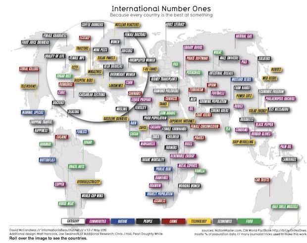
Eighth – there is some great material on this site – Information is Beautiful – not least the ‘International number ones’ infographic – because every country is best at something! (Click on the link above, the pic below doesn’t do it justice!)


Ninth, and only ninth because it’s not really a data visualistaion – but still pretty fab for inducing panic – Worldometers is a counting clock that looks population trends, spending on certain things, environmental decline, deaths from certain diseases and society and media. Some of the things you learn are –

  • The world population is 7 billion and counting
  • There are 2.3 billion Internet users – growing (rapidly) – also over 3 million blog posts today alone!
  • There are 900 billion undernourished people and
  • 1.5 billion overweight people
  • More than 4 billion a day is spent on the military and 26 billlion so far this year has been spent on drugs!.

And tenth – well I didn’t get to ten – If you really can’t deal with my stopping at 9. then why not suggest youre favourite ‘global data visualisation’?

What is The Human Development Index?

Australia has the highest HDI in the world - that alone should make you suspicious its validity
Australia has the highest HDI in the world - that alone should make you suspicious of its validity

I’ve developed a new appreciation for how crazy the HDI is as a measurement of a country’s development. Thank the lord they don’t apply the same sliding scale criteria to educational achievement in this country – oh, hang on, they do! Anyway – here’s some info on the HDI….

The Human Development Index is a summary measure for assessing long-term progress in three basic dimensions of human development: a long and healthy life, access to knowledge and a decent standard of living.

Human Development is now measured using four indicators

  • Life expectancy at birth
  • Mean years of adult education adults over 25 have received
  • The number of expected years of education children attending school can expect
  • Gross National Income per capita (PPP)

The UN (who monitor Human Development) give each country a rank from between 0 and 1 based on how well it scores in relation to ‘constructed minimum’ and ‘observed maximum scores for each of these criteria. The minimum and maximum scores for each criteria are as below

  Minimum scores* Perceived maximums
Life expectancy at birth 20 83.2
Mean years of adult education adults over 25 have received 0 13.2
The number of expected years of education children attending school can expect 0 20.6
Gross National Income per capita (PPP) 163 108, 211

(*This is the level below which the UN believes there is no prospect for human development!)

How does the HDI work out a country’s score? – it’s quite easy – if a country has a life expectancy of 83.2, and all the other maximums, it would score one, if it had a life expectancy of 20, and all the other minimums it would score zero. If it was half way between the minimum and maximum – it would score 0.5 – NB by the UK’s standards, this would be a pretty low level of human development!

So what do the scores mean?

Well a country scores 1-0.788 it’s has ‘high human development’ and is classified as a ‘developed country’ – as are 42 countries – most of the European countries come into this category.

All the rest are classified as ‘devloping countries (the figures are rough!)

  • A score of 0.785 -0.675 means a country has ‘high human development – eg Mexico and Brazil
  • 0.670 – 0.480 – Medium human development – eg China and Botswana
  • 0.48 and lower – Low human development – eg Ethiopia.


This site is great for doing the comparisons! – the UN data site – you can mash the data up and do loads of stuff –

You get a feeling for how HDI is changing over time….

HDI_graph

Or you can break up the data and compare two or more countries… (click on it – it’ll enlarge!)

btsw china

It’s worth noting that there have been some changes to the HDI this year – !

‘Access to knowledge’ used to be measured by the adult literacy rate and combined gross enrolment in education – but because many of the world’s developed nations have reached 100% in both of these – this meant there would be less room for discriminating between the most and least developed nations (NB – This is one of the biggest problems with the HDI – because it is a relative scale – they just go on moving the goal posts – thus some countries will always appear underdeveloped… one could argue that having 100% literacy and enrolment is enough of a development goal in education – rather than the idea of spending a longer time in education as being desirable?)

Standard of living used to be measured by GDP per capita – but is now measured by Gross National Income (GNI) per capita in PPP US$. While GDP is a measure of economic output, it does not reflect a country’s disposable income—some profits may be repatriated abroad, some residents 2  receive remittances from abroad, and in some cases inbound aid flows may be sizeable. GNI adjusts the GDP for these factors and is therefore a better measure of a country’s level of income.

Also, the United Nations is now going to report on an even greater range of indicators of development than ever before – this post from the Global Sociology Blog has more… talking about the new focus on inequalities within developing nations – which is something that Hans Rosling also talks about in this video – great for visual graphics showing development!!!